top of page
Childrens Book - College project

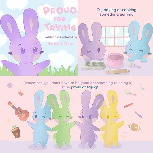
activities and hobbies, such as sports, music and baking. For my book I wanted a fairly simple style and a more limited colour palette so the images seem more relaxing and not too overwhelming to look at for younger children. I also made sure to keep my writing quite simple, as the idea of this book is to be read to/with very young children. I used a very simple sans serif font for body text and a more bubbly and bold sans serif font for the main title.
I drew all aspects of the illustration myself in IOS software Procreate, and then used Adobe Photoshop and InDesign to add text and put the pages together.
For my final project during my HND year, I was given the freedom to create whatever I wanted as my final piece. Since I had often found myself inspired by children's books, I decided to write and illustrate my own.
The book is called "Proud for Trying", a book aimed at very young children, featuring four bunny characters that I designed myself.
The main aim of the book was something that I have not often seen represented in the media, especially not children's books, which is that you don't have to be good at something you enjoy, and that you should just be proud of trying, leading to the name of my book.
The book had ten pages, including a double page at the end, as well as a front and back cover. The characters are 4 different coloured bunnies which feature on each page demonstrating different

Novel bite - Collage


This was a project during my HND year. This was a live brief, and also a group project. The first part of the project was to work individually to each design a logo for the Novel Bite Café, which is a local café in Winsford, Cheshire.
My logo was designed in Illustrator, Which I designed while following the brand guidelines given to me.
After all the logos were complete the manager at Novel Bite chose which one would be the cafés new logo, and my one was selected. Because of this I became the project leader, and the rest of the project became a group one.

With the help of the group I decided on a flat illustration style, and then as a group we produced images in this style to go with various designs we were asked to make. These included business cards, posters and menus, which were all designed in illustrator.
Brewdog can design - college Project
This was a project during my HNC year. For this project I was asked to create a limited edition promotional packing for an already existing BrewDog drink. I decided to make a drink in collaboration with the Bat Conservation Trust. The design features the standard BrewDog brand aspects that are used on all their cans, as well as The Bat Conservation Trust logo. The design features an orange to yellow gradient background with a bat repetitive pattern on top.
All aspects of this design were created in Adobe Illustrator, with the mock up images being created in Adobe Photoshop.


Mock up of Cans
Flat Design
Folklore Zine - college Project
This project was done during my HNC year, and was a fictional brief focusing on visual narratives, where I was asked by Salford Zine Library to create a new, unique zine that communicates some sort of narrative.
I created mine using traditional art (watercolour and pen), handmade title typography (papercut) and added body text and put the design together in Adobe Photoshop. The zine is a visual narrative about different creatures in American Folklore.

Back Page
Front Cover

Page 1 - Wendigo
Page 4 - Mothman

Page 3 - Mothman
Page 2 - Wendigo

Pages 5 & 6 - Double page 0n Fresno Nightcrawlers
PRINTMaking Gig posters - college project

This project was done in my HNC year. For this I was asked to create concert posters based on a band or solo artist of my choice. I had to show the ability to be able to manage different techniques and progress, and the final designs must have used both traditional printmaking techniques and digital editing methods.
My poster was based on Manchester based rock band "The Oozes", showing imagery from one of their albums. I created the imagery using the printing method reduction lino, and I put the rest of the design together in Adobe Illustrator.
I wanted this poster to be quite simple and advertise a one off special show in their hometown, so the poster has their band logo, location and date.
Penguin Book Cover Design Competition - college project

This is my entry to the Penguin Book Cover Design Competition. For this unit my final design must have used both traditional and digital design. I chose to create a design for the book "Diary of a Young Naturalist"
The illustrations are created using digital outlines with the colouring and shading done using traditional media, such as watercolour.
I then posted the design together and added text on Adobe Illustrator.
bottom of page


